
A few months ago I noticed some big changes in my online credit card account. The dashboard panel, which had always shown my credit card stats with numbers, was now displayed with colored graphs and charts. Now the dashboard shows me my current balance, as compared to my total limit, visually and numerically.
The dashboard shows me a wheel that indicates how much has already been credited and how much is pending against my total limit, by using different colors. It also displays my current balance, available amount, and total limit numerically. To the right of the balance wheel, I get an overview of how much I spent each day on my credit card, relative to other days. If I hover over the graph, I can get an exact number of how much I spent that day.
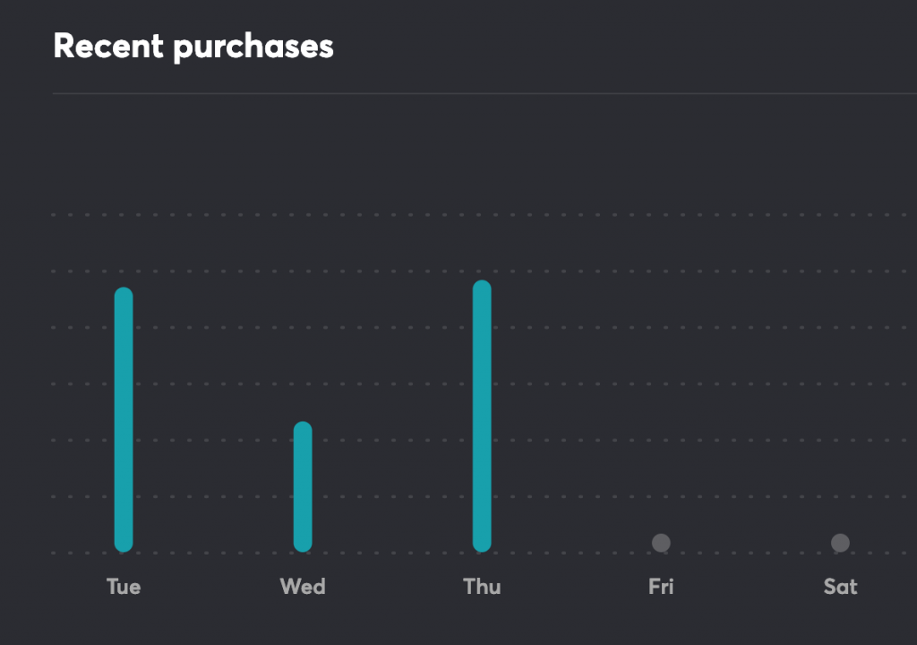
From the dashboard I can go to the “Transactions” section. This gives me a detailed breakdown of all my transactions which I can then filter based on date, vendor, transaction type, or expense category. The credit card determines the category, which includes household, groceries, shopping, services, transportation and miscellaneous. From “Transactions,” I can look at “Trends,” a bar graph showing how much I spend in each category, or each day over a period of time.
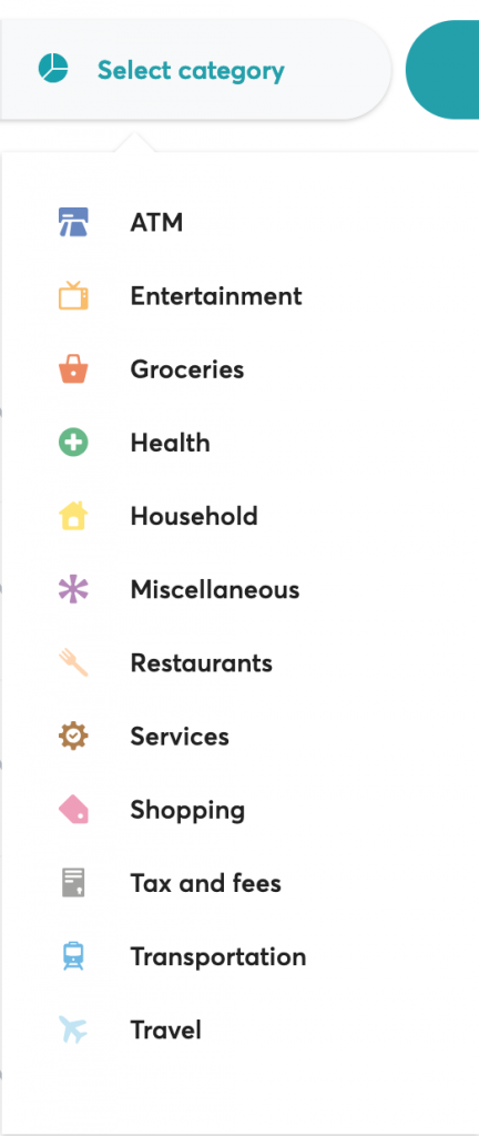
All of this is fine in theory, but my challenge is that the categories don’t match how I like to track my expenses and they’re not accurate. For example, my monthly health insurance payments get categorized as “miscellaneous” instead of “health.” I can’t change this.
In general, I find the miscellaneous category problematic. As a records and information management professional, we’re trained not to use this word to describe anything mostly because it’s a word that can mean everything or nothing, all at the same time. I find this category assignment pretty useless and misleading.
I suppose the goal of this is to give me more information about my spending habits. Perhaps then I can make better or more informed decisions about how and where to spend my money. I can notice patterns and identify which categories I spend the most money in. But if I can’t customize the categories, or at least have the option of reassigning transactions to the proper category, the end result is not that useful for me.
1 comment for “Analytics and Dashboards”